1st chunk of `content/manuals/extensions/extensions-sdk/design/design-guidelines.md`
94319961f546f5c9b611d64fa4f5b7e21082364de0720e9f00000001000005f3
---
title: Design guidelines for Docker extensions
linkTitle: Guidelines
description: Docker extension design
keywords: Docker, extensions, design
aliases:
- /desktop/extensions-sdk/design/design-guidelines/
weight: 10
---
At Docker, we aim to build tools that integrate into a user's existing workflows rather than requiring them to adopt new ones. We strongly recommend that you follow these guidelines when creating extensions. We review and approve your Marketplace publication based on these requirements.
Here is a simple checklist to go through when creating your extension:
- Is it easy to get started?
- Is it easy to use?
- Is it easy to get help when needed?
## Create a consistent experience with Docker Desktop
Use the [Docker Material UI Theme](https://www.npmjs.com/package/@docker/docker-mui-theme) and the [Docker Extensions Styleguide](https://www.figma.com/file/U7pLWfEf6IQKUHLhdateBI/Docker-Design-Guidelines?node-id=1%3A28771) to ensure that your extension feels like it is part of Docker Desktop to create a seamless experience for users.
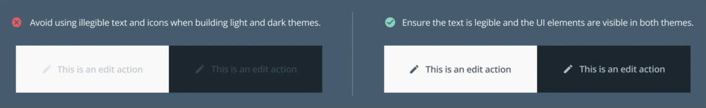
- Ensure the extension has both a light and dark theme. Using the components and styles as per the Docker style guide ensures that your extension meets the [level AA accessibility standard.](https://www.w3.org/WAI/WCAG2AA-Conformance).
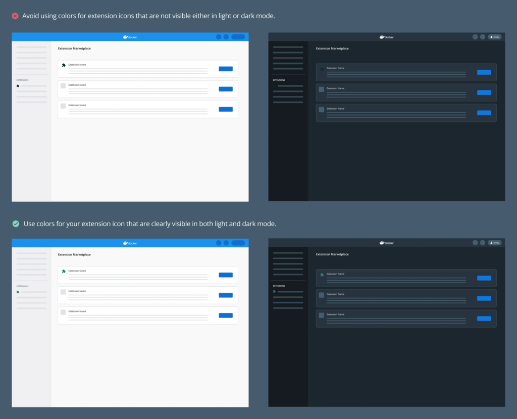
- Ensure that your extension icon is visible both in light and dark mode.